One platform.
Seven retail worlds.

How I adapted a headless e-commerce design system to work across radically different retail verticals — from fresh produce markets to motorcycle dealerships — without rebuilding from scratch.

$20M

Total GMV

9.5%

Conversion Rate

95%

Fulfillment Rate

482K

Orders Processed

Born in a pandemic.Scaled across an industry.

Katapult Commerce was built during the pandemic to help Colombia’s largest supermarket launch its digital channel in record time. The result was a resounding success: 482,000 orders, 14 cities, and $20M USD in GMV within 12 months.


That proof of concept unlocked a bigger opportunity: turn the platform into a white-label SaaS product that any retailer could adopt. That’s where I came in.


My challenge wasn’t to build the platform from scratch, it was to make it feel native in worlds as different as a fresh produce market, a leather goods boutique, and a spirits distributor.

10 → 50 support tickets/week.

As the platform expanded to new retailers, cracks appeared fast. Support tickets multiplied 5x in a matter of weeks, pointing to three underlying problems:

01 Navigation designed for one type of buyer didn’t translate to others.

02 Workflows that made sense in grocery were redundant in fashion or automotive.

03 Processes were error-prone when applied outside their original context.

The UX Challenge

Same system. Radically different buying behaviors.

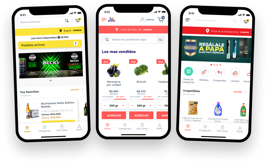
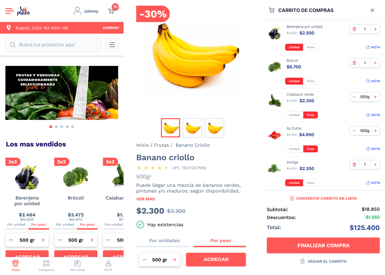
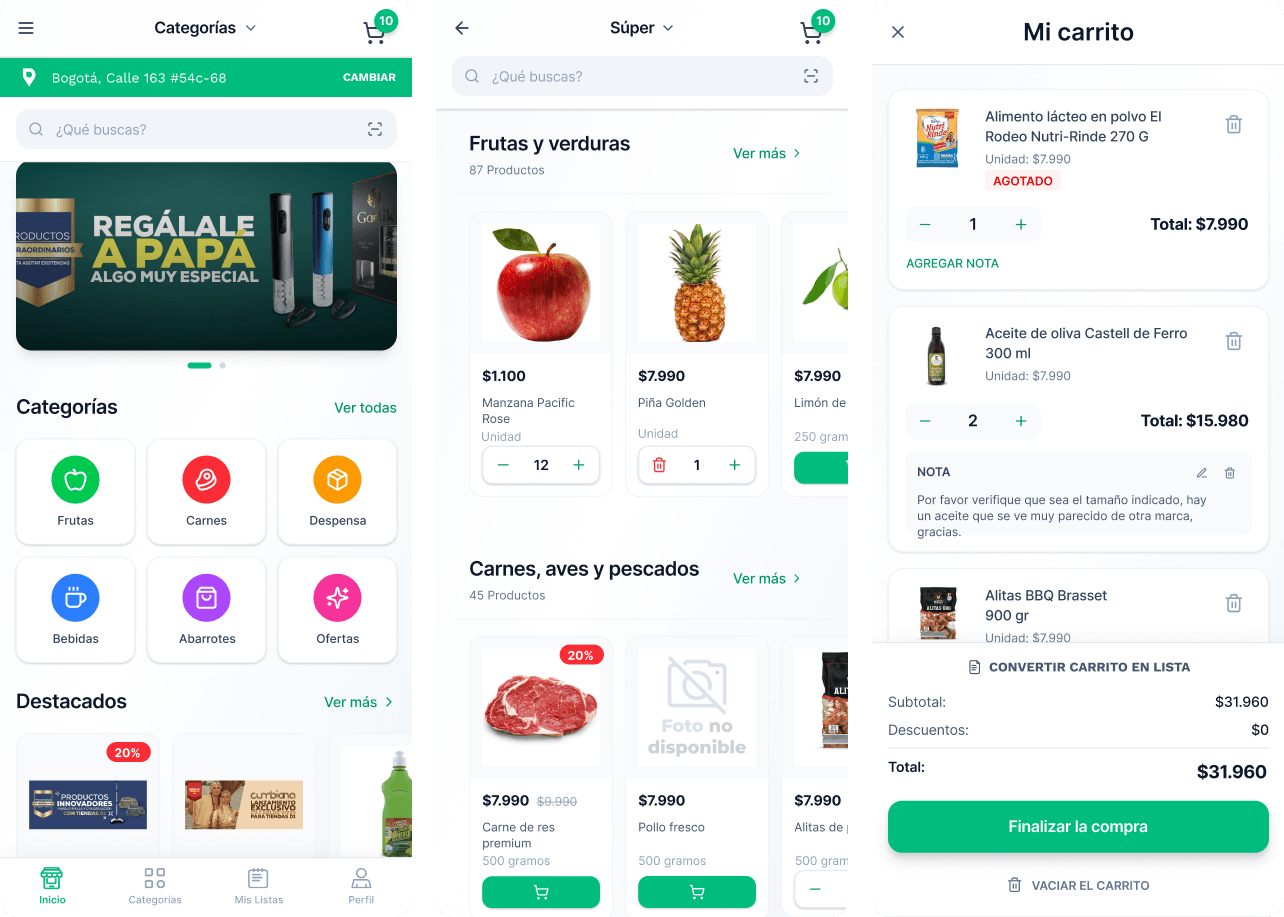
Each vertical has its own purchasing logic. Adapting the platform meant understanding those mental models first — then deciding what to change, what to keep, and what to build from scratch.

Grocery & Fruver

Habitual, speed-first shopping. Users return weekly with the same list. Discovery is secondary. Speed, substitutions, and variable units (kg, lb, unit) are critical.

Fashion & Accessories

Emotional, browse-heavy experience. Size and material selection, product storytelling, and aspiration drive conversion. Utility comes second.

Spirits & Beverages

Legal age verification is non-negotiable. Catalog is specialized, premium, and nocturnal in tone. Trust and expertise must come through in every interaction.

My Process

From brand guidelines to lived experience.

01. Vertical Immersion
For each new client, I analyzed their brand guidelines and studied the behavior of their real buyers — not just their aspirational user. I mapped industry-specific constraints: age verification for spirits, variable weight units for fresh produce, spec-heavy PDPs for vehicles. Before touching Figma, I needed to understand the world the buyer lives in.

02. Gap Analysis per Vertical
I audited the base system against each client’s needs and produced a three-tier classification: what works as-is, what needs adjustment, and what needs to be designed from scratch. This prevented over-engineering while ensuring nothing critical was missed.

03. Design Token Adaptation
Using a tokenized component library, I mapped each client’s brand guidelines to the system’s color, typography, spacing, and motion tokens. The goal: make the platform feel genuinely theirs without touching the underlying functional logic. Fast to implement, easy to maintain.

04. Experience Decisions per Vertical
Beyond visuals, I redefined navigation hierarchies, content priorities, and key flows based on the buying behavior of each vertical. The homepage of a fruver isn’t structured the same way as a spirits retailer — even if both use the same component library.

05. Validation & Iteration
Short cycles of prototype → usability testing with real users from each retailer’s audience. Combined with behavioral data from the platform’s built-in BI, each launch informed the next one — creating a compounding system improvement across verticals.

Vertical 01 — Fruver

Tu Plaza: Fresh Produce · Colombia

Fresh produce buyers think in quantities, not units. A banana isn’t “1 product”, it’s 500g or a bunch. The base system wasn’t built for that. We were.

Key UX Decision

Fresh products can’t be sold in fixed units. I redesigned the quantity selector to handle variable weights — grams, kilograms, pounds, and approximate unit counts — with real-time price calculation. A secondary substitution flow was added so that when a product is unavailable, the user stays in control of what replaces it, reducing post-order friction significantly.

Vertical 02 — Grocery

Tienda Zapatoca & Tiendas 3B / Grocery · Colombia & México​

A grocery shopper doesn’t browse, they execute. The design needed to get out of the way and let experienced buyers move fast.

Key UX Decision

Grocery buyers are repeat visitors with predictable carts. I prioritized speed over discovery: quick-add from category pages, a persistent recent purchases module, and a streamlined checkout that saves previously used addresses and payment methods. Navigation was restructured around utility, not inspiration.

Vertical 03 — Liquor store

Licoexpress & Flash / Spirits & Beverages · Colombia

Designing for spirits meant navigating legal constraints without creating unnecessary friction, and building an experience that feels as premium as the product.

Key UX Decision

Age verification is a legal requirement, but it shouldn’t block access unnecessarily. I designed a progressive verification system that allows users to create an account in seconds, with minimal upfront friction, while clearly communicating that identity and age validation will be required before purchase.


Instead of a hard gate, the experience uses graduated access: users can explore the catalog immediately after signup, but must complete age and identity verification to unlock transactions. This approach aligns with compliance needs while preserving conversion.


Once inside, the experience shifts to a more premium layer: rich product descriptions, origin details, and pairing suggestions, supported by a dark visual language that reflects the category’s tone. Clear account states: “Cuenta creada”, “Verificación pendiente”, and “Verificado”, ensure users always understand where they stand and what’s required next.

An adaptable system doesn't just scale. It compounds.

Credit_card_perspective_matte_s 1

$20M

Total GMV across the platform
Validated by the origin case

Message_perspective_matte_s 1

95%

Fulfillment rate
Across 482,000 orders in 14 cities

Location_perspective_matte_s 1

14

Cities in operation
Grocery · Fruver · Spirits · Fashion · Automotive

Fingerprint_perspective_matte_s

9.5%

Conversion rate
3–4× the regional e-commerce average of 2–3%

Settings_perspective_matte_s 1

7+

Retail verticals launched
Without rebuilding the system from scratch

Add_apps_perspective_matte_s

↓5×

Reduced onboarding friction
From bespoke builds to tokenized adaptation

The real output wasn’t a set of screens, it was a replicable design process that let the platform grow vertically and geographically without losing coherence, speed, or the experience quality that made the first case a success.

Ready to create something amazing?

Lets Work Together

What does it take to create a best-selling app? Perfectly-timed microinteractions. See how these tiny, often-overlooked details can have an enormous impact on emotion –and learn how to incorporate them wisely.